Graphing
Hydrofunctions provides several ways to plot your data in a Jupyter notebook. Many of these methods use the graphing methods built-in to the Pandas dataframe. Some of these methods are specific to Hydrofunctions. All of these techniques use matplotlib under the hood to create the charts, so Hydrofunctions includes it during installation.
Getting ready
First step: Automatic display of charts in Jupyter
The first step for creating a graph is to import Hydrofunctions, and then provide Jupyter with a directive to automatically display all charts from matplotlib:
>>> import hydrofunctions as hf
>>> %matplotlib inline
Second step: Preparing our data for plotting
The next step is to request some data from the NWIS for us to plot:
>>> request = hf.NWIS('01585200', 'dv', period='P999D')
Next, we create a dataframe called ‘data’ from our request:
>>> data = request.df('q')
The rest of the examples will assume that we have a dataframe called data.
Flow duration chart
Flow duration charts are cumulative frequency charts that are used in hydrology to compare stream flow at different stream gauges. They are constructed with daily mean discharge data, and are typically used to analyze the typical baseflow and low flow conditions. They are similar to a flood frequency analysis, in that they both try to illustrate the relationship between the magnitude of the flows and the frequency that these flows occur. Large discharges occur infrequently, while it is common to see a baseflow discharge or higher.
Hydrofunctions includes a Flow Duration Chart, which you access as a function:
>>> hf.flow_duration(data)
Options include the ability to change the following:
xscale: default is ‘logit’; may also be ‘linear’
yscale: default is ‘log’; may also be ‘linear’
ylabel: default is ‘Discharge’; may be any string.
- symbol: default is ‘.’ for small points. May also be:
pixel point: ‘,’
up triangle: ‘^’
circle: ‘o’
plus: ‘+’
Example of a flow duration chart using all of the defaults (‘log’ y axis and ‘logit’ x axis).
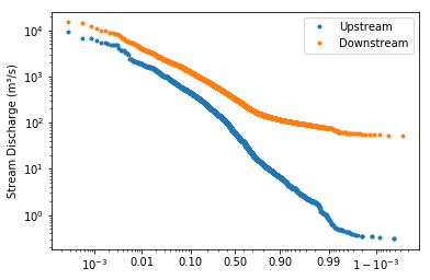
This chart compares the discharge at two locations: a smaller upstream site on the Shenandoah River, and a larger downstream site with higher discharges. The y axis uses the default logarithmic scale, because river discharges frequently range over several orders of magnitude. The x axis plots the probability that a discharge of this size or larger will occur on any given day. Note that the graph slopes from the upper left to the lower right in an inverse relationship. This means that the river has a low probability of exceeding the high flows, and a high probability of exceeding the low flows. The line for the larger stream is always above the line for the smaller stream because the larger stream has higher discharges.
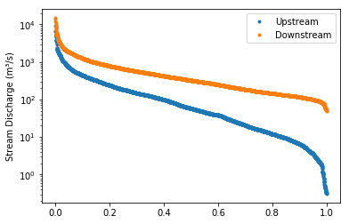
The first graph used a ‘logit’ scale on the x axis, while this second graph uses a ‘linear’ x axis to plot the same data. The logit scale will render a normal “bell curve” distribution as almost a straight line in a cumulative graph. In the second chart, the linear x axis uses the same distance between 80 and 90% as between 40 and 50%. In both graphs, the median value is plotted in the center of the x axis, at the 50% mark, since it has a 50% chance of happening on any given day.
Cycle plot
The cycle plot was inspired by an example created by Jake VanderPlas in his 2016 book, Python data science handbook: essential tools for working with data.
This graph is designed for discovering cyclical components within a series. For example, there is a ‘diurnal’ cycle in the amount of sunlight that you get over the course of a day. Because the amount of sunlight also changes with the seasons, you can see an ‘annual’ cycle in sunlight and in temperatures over the course of a year.
In  [7]: hf.cycleplot(data, 'annual-week')
Out [7]:
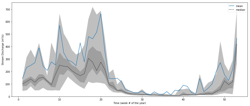
In the graph above, several years of data for a site along the Shenandoah River were grouped into 52 different bins, each corresponding to a different week of the year. Then the mean and median values in each bin were connected with lines. A light gray band was drawn around the 0.2 to 0.8 quantile range and a dark gray band was drawn around the 0.4 to 0.6 quantile range.
In  [7]: hf.cycleplot(temp_data, 'diurnal', compare='month', y_label="Water Temperature (°C)")
Out [7]:
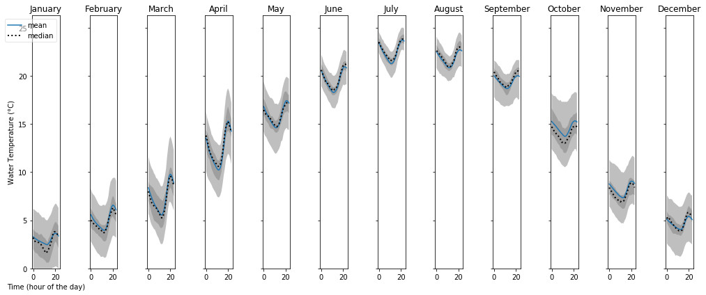
In this graph, we are showing how the water temperature varies over the course of a day during each of the twelve months of the year. Temperatures are warmest in July and coldest in January. However, over the course of a day, the lowest temperature occurs at hour 12 and the warmest temperature around hour 20. Since these temperatures are in UTC, and this site is in the Eastern Time Zone (UTC-5), these times correspond to 7 am and 3 pm (20 -5 = 15:00 hours, or 3pm).
Pandas plotting
The Pandas dataframe has several different graphing methods built-in. Access these methods using dot notation, like this:
Plotting a hydrograph:
In [1]: data.plot()
Plotting a histogram:
In  [1]: data.hist()
In  [1]: data.plot.hist()
Box plot:
In [1]: data.plot.box()
Kernel density plot:
In [1]: data.plot.kde()
